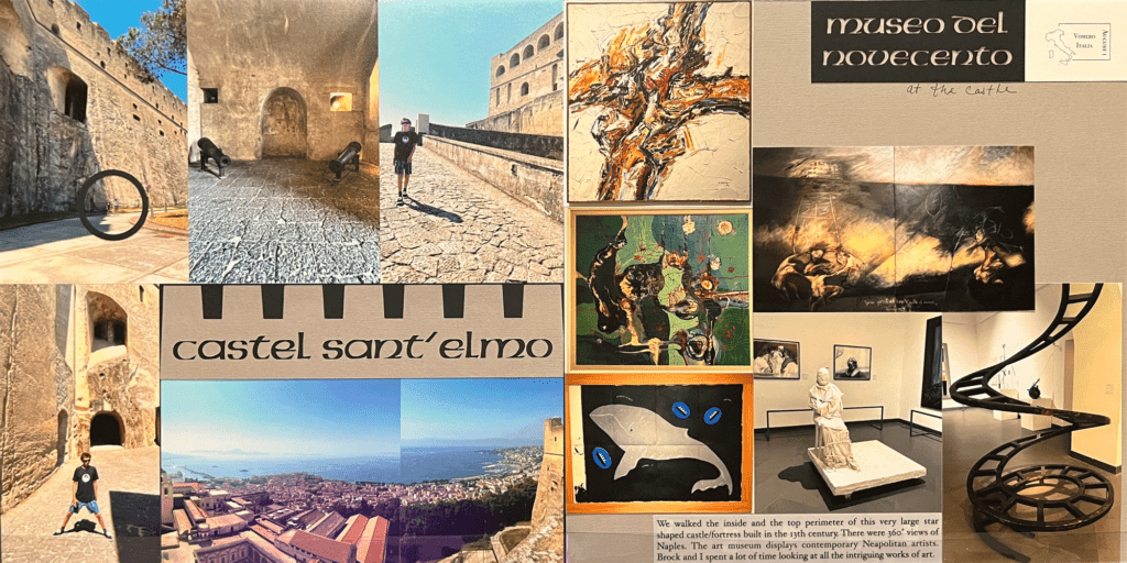
That’s right! Twelve (12) pictures! And not just photos on a page – there’s some decoration here to set the tone for this place we traveled to.
Scrapbooking travel photos or any photos for that matter usually includes many, many things. You can’t crop out the background of the gorgeous place you’re in or crop out important details that are the whole point of scrapbooking these photos in the first place!
Fitting all of it into your pages is where creativity meets order. Using creative ideas of how to design the page along with an organized selection of which photos tell the whole story without leaving out anything important is the purpose of the finished page.

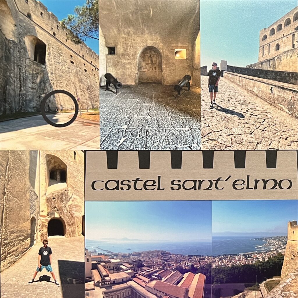
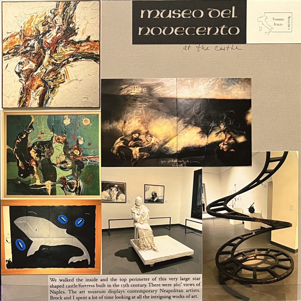
This is from my Italy album, and I just want to highlight the fact that this layout has an aesthetic all its own by way of design. Simple, yet related to the place we were in with a certain old castle feel. I cropped most of the photos just a bit to keep the important stuff and also fit them onto the page. I loved the castle and I was so blown away by the museum works of art that I had to include my favorite pieces.

The Cricut font I used here is called american unical com regular. I cut out the castle shape and then cut the title out of that. I liked the negative effect of this so much that I also did the same thing for the museum page. If you do this remember to keep the little pieces of inside letters such as the ‘a’ and ‘o’ and ‘e’. I used grey and black paper and I typed our journaling onto some vellum.

Do you like to scrapbook with a lot of photos? Or do you like to just have one or 2 photos on a page?
Thank you for stopping by. Happy Scrapping!


Leave a Reply